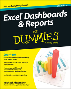
Excel Dashboards & Reports For Dummies (2nd Ed.)
Create dynamic dashboards and put your data on display with ForDummies
No matter what business you’re in, reports have become a staple of the workplace, but what good is a report if no reads it, or even worse, understands it? This all new edition of Excel Dashboards & Reports For Dummies is here to help you make meaning of all your data and turn it into clear and actionable visualizations. Fully updated for the latest business intelligence and spreadsheet tools in Excel 2013, this book shows you how to analyze large amounts of data, quickly slice data into various views on the fly, automate redundant reporting, create eye-catching visualizations, and more.
- Helps you move beyond reporting data with simple tables, rows, and columns to designing high-impact reports, dashboards, and visuals
- Walks you through a wide array of technical and analytical concepts to give you the background you need to select the right tool for interpreting and displaying data
- Covers how to build a chart, work with pivot tables, group and bucket your data, represent trends, create What-If analyses, and increase the value of your reports
Excel Dashboards & Reports For Dummies, 2nd Edition is the business analysis tool you need to transform your raw data into a powerful and effective presentation that is accessible to everyone.
About This Book 2
Foolish Assumptions 3
Icons Used In This Book 3
Beyond the Book 4
Where to Go from Here 5
Part I: Getting Started with Excel Dashboards and Reports 7
Chapter 1: Getting in the Dashboard State of Mind 9
Defining Dashboards and Reports 9
Defining reports 10
Defining dashboards 11
Preparing for Greatness 12
Establish the audience and purpose for the dashboard 12
Delineate the measures for the dashboard 13
Catalog the required data sources 14
Define the dimensions and filters for the dashboard 15
Determine the need for drill-down features 15
Establish the refresh schedule 16
A Quick Look at Dashboard Design Principles 16
Rule number 1: Keep it simple 17
Use layout and placement to draw focus 18
Format numbers effectively 19
Use titles and labels effectively 20
Chapter 2: Building a Super Model 21
Data Modeling Best Practices 22
Separating data, analysis, and presentation 22
Starting with appropriately structured data 25
Avoiding turning your data model into a database 28
Using tabs to document and organize your data model 29
Testing your data model before building reporting components on top of it 31
Excel Functions That Really Deliver 32
The VLOOKUP function 32
The HLookup function 36
The Sumproduct function 37
The Choose function 41
Using Smart Tables That Expand with Data 43
Converting a range to an Excel table 44
Converting an Excel table back to a range 46
Part II: Building Basic Dashboard Components 47
Chapter 3: Dressing Up Your Data Tables 49
Table Design Principles 49
Use colors sparingly 50
De-emphasize borders 52
Use effective number formatting 54
Subdue your labels and headers 55
Getting Fancy with Custom Number Formatting 57
Number formatting basics 57
Formatting numbers in thousands and millions 59
Hiding and suppressing zeroes 62
Applying custom format colors 62
Formatting dates and times 63
Chapter 4: Sparking Inspiration with Sparklines 65
Introducing Sparklines 65
Understanding Sparklines 67
Creating sparklines 68
Understanding sparkline groups 70
Customizing Sparklines 71
Sizing and merging sparkline cells 71
Handling hidden or missing data 72
Changing the sparkline type 73
Changing sparkline colors and line width 73
Using color to emphasize key data points 73
Adjusting sparkline axis scaling 74
Faking a reference line 75
Specifying a date axis 77
Autoupdating sparkline ranges 78
Chapter 5: Formatting Your Way to Visualizations 79
Enhancing Reports with Conditional Formatting 79
Applying basic conditional formatting 80
Adding your own formatting rules manually 88
Show only one icon 91
Show Data Bars and icons outside of cells 94
Representing trends with Icon Sets 96
Using Symbols to Enhance Reporting 98
The Magical Camera Tool 102
Finding the Camera tool 102
Using the Camera tool 103
Enhancing a dashboard with the Camera tool 105
Chapter 6: The Pivotal Pivot Table 107
An Introduction to the Pivot Table 107
The Four Areas of a Pivot Table 108
Values area 108
Row area 109
Column area 109
Filter area 110
Creating Your First Pivot Table 111
Changing and rearranging your pivot table 114
Adding a report filter 115
Keeping your pivot table fresh 116
Customizing Your Pivot Table Reports 119
Changing the pivot table layout 119
Customizing field names 120
Applying numeric formats to data fields 122
Changing summary calculations 122
Suppressing subtotals 124
Showing and hiding data items 127
Hiding or showing items without data 128
Sorting your pivot table 132
Creating Useful Pivot-Driven Views 133
Producing top and bottom views 133
Creating views by month, quarter, and year 137
Creating a percent distribution view 139
Creating a YTD totals view 141
Creating a month-over-month variance view 142
Part III: Building Advanced Dashboard Components 145
Chapter 7: Charts That Show Trending 147
Trending Dos and Don’ts 147
Using chart types appropriate for trending 148
Starting the vertical scale at zero 150
Leveraging Excel’s logarithmic scale 151
Applying creative label management 153
Comparative Trending 156
Creating side-by-side time comparisons 156
Creating stacked time comparisons 158
Trending with a secondary axis 160
Emphasizing Periods of Time 163
Formatting specific periods 163
Using dividers to mark significant events 165
Representing forecasts in your trending components 166
Other Trending Techniques 167
Avoiding overload with directional trending 167
Smoothing data 168
Chapter 8: Grouping and Bucketing Data 173
Creating Top and Bottom Displays 173
Incorporating top and bottom displays into dashboards 174
Using pivot tables to get top and bottom views 175
Using Histograms to Track Relationships and Frequency 178
Adding formulas to group data 179
Adding a cumulative percent 183
Using a pivot table to create a histogram 185
Emphasizing Top Values in Charts 187
Chapter 9: Displaying Performance against a Target 191
Showing Performance with Variances 191
Showing Performance against Organizational Trends 193
Using a Thermometer-Style Chart 194
Using a Bullet Graph 195
Creating a bullet graph 196
Adding data to your bullet graph 200
Final thoughts on formatting bullet graphs 200
Showing Performance against a Target Range 203
Part IV: Advanced Reporting Techniques 207
Chapter 10: Macro-Charged Dashboarding 209
Why Use a Macro? 209
Recording Your First Macro 210
Running Your Macros 214
Enabling and Trusting Macros 217
Macro-enabled file extensions 217
Enabling macro content 217
Setting up trusted locations 218
Excel Macro Examples 219
Building navigation buttons 219
Dynamically rearranging pivot table data 220
Offering one-touch reporting options 221
Chapter 11: Giving Users an Interactive Interface 223
Getting Started with Form Controls 223
Finding Form controls 224
Adding a control to a worksheet 226
Using the Button Control 227
Using the Check Box Control 228
Check box example: Toggling a chart series on and off 229
Using the Option Button Control 232
Option Button Example: Showing Many Views through One Chart 233
Using the Combo Box Control 236
Combo Box Example: Changing Chart Data with a Drop-Down Selector 237
Using the List Box Control 239
List Box Example: Controlling Multiple Charts with One Selector 241
Chapter 12: Adding Interactivity with Pivot Slicers 245
Understanding Slicers 245
Creating a Standard Slicer 247
Formatting Slicers 250
Size and placement 250
Data item columns 250
Slicer color and style 251
Other slicer settings 252
Controlling Multiple Pivot Tables with One Slicer 253
Creating a Timeline Slicer 254
Using Slicers as Form Controls 256
Part V: Working with the Outside World 261
Chapter 13: Using External Data for Your Dashboards and Reports 263
Importing Data from Microsoft Access 263
The drag-and-drop method 264
The Microsoft Access Export wizard 265
The Get External Data icon 266
Importing Data from SQL Server 271
Chapter 14: Sharing Your Workbook with the Outside World 275
Protecting Your Dashboards and Reports 275
Securing access to the entire workbook 275
Limiting access to specific worksheet ranges 279
Protecting the workbook structure 283
Linking Your Excel Dashboards to PowerPoint 284
Creating a link between Excel and PowerPoint 284
Manually updating links to capture updates 286
Automatically updating links 288
Distributing Your Dashboards via a PDF 289
Distributing Your Dashboards to SkyDrive 291
Limitations when Publishing to the Web 294
Part VI: The Part of Tens 295
Chapter 15: Ten Chart Design Principles 297
Avoid Fancy Formatting 297
Skip the Unnecessary Chart Junk 299
Format Large Numbers Where Possible 301
Use Data Tables instead of Data Labels 302
Make Effective Use of Chart Titles 304
Sort Your Data before Charting 304
Limit the Use of Pie Charts 305
Don’t Be Afraid to Parse Data into Separate Charts 306
Maintain Appropriate Aspect Ratios 307
Don’t Be Afraid to Use Something Other Than a Chart 308
Chapter 16: Ten Questions to Ask Before Distributing Your Dashboard 309
Does My Dashboard Present the Right Information? 309
Does Everything on My Dashboard Have a Purpose? 309
Does My Dashboard Prominently Display the Key Message? 310
Can I Maintain This Dashboard? 310
Does My Dashboard Clearly Display Its Scope and Shelf Life? 311
Is My Dashboard Well Documented? 311
Is My Dashboard Overwhelmed with Formatting and Graphics? 312
Does My Dashboard Overuse Charts When Tables Will Do? 312
Is My Dashboard User-Friendly? 313
Is My Dashboard Accurate? 314
Index 315
Michael Alexander is a Microsoft Certified Application Developer (MCAD) and author of several books on Microsoft Access and Excel. He has more than 15 years’ experience consulting and developing Office solutions and has been named a Microsoft MVP for his ongoing contributions to the Excel community.
Date de parution : 03-2014
Ouvrage de 336 p.
18.3x22.9 cm
Disponible chez l'éditeur (délai d'approvisionnement : 12 jours).
Prix indicatif 31,03 €
Ajouter au panierThème d’Excel Dashboards & Reports For Dummies :
Mots-clés :
michael alexander, excel dashboards and reports, excel dashboards, excel reports, excel dashboards book, how to use excel dashboards, create excel reports, excel guidebook, excel guide, excel guidebook, excel 2013, excel reporting, Data Pig, what-if analyses, excel 2013 dashboards, excel 2013 reports, excel 2013 book, excel 2013 guide, pivot tables, data visualization, excel analysis, excel business intelligence, microsoft bi, microsoft business intelligence